← View series: machine learning
~/blog
Exploratory Data Analysis of Red Wine Quality
EDA on the Red Wine Quality Dataset
The Red Wine Quality dataset captures physicochemical measurements of Portuguese Vinho Verde wines — acidity levels, sulfur dioxide, residual sugar, pH, alcohol — alongside sensory quality scores from 3 to 8. Before any modeling, exploratory data analysis reveals the dataset's structure, cleanliness, and feature relationships. This walkthrough covers descriptive statistics, missing value inspection, duplicate detection, and correlation analysis.
import pandas as pd
import matplotlib.pyplot as plt
import seaborn as sns

df = pd.read_csv('winequality-red.csv')
df.head()
All features are numeric — 11 physicochemical inputs and one quality score. The info() method confirms the column types and memory footprint, while describe() surfaces central tendency, spread, and range for each feature.
df.info()Descriptive statistics — count, mean, standard deviation, min, quartiles, max — give a first sense of the data's range and distribution. Fixed acidity spans 4.6 to 15.9, alcohol ranges from 8.4% to 14.9%, and quality scores average 5.6.
df.describe()| fixed acidity | volatile acidity | citric acid | residual sugar | chlorides | free sulfur dioxide | total sulfur dioxide | density | pH | sulphates | alcohol | quality | |
|---|---|---|---|---|---|---|---|---|---|---|---|---|
| count | 1599.000000 | 1599.000000 | 1599.000000 | 1599.000000 | 1599.000000 | 1599.000000 | 1599.000000 | 1599.000000 | 1599.000000 | 1599.000000 | 1599.000000 | 1599.000000 |
| mean | 8.319637 | 0.527821 | 0.270976 | 2.538806 | 0.087467 | 15.874922 | 46.467792 | 0.996747 | 3.311113 | 0.658149 | 10.422983 | 5.636023 |
| std | 1.741096 | 0.179060 | 0.194801 | 1.409928 | 0.047065 | 10.460157 | 32.895324 | 0.001887 | 0.154386 | 0.169507 | 1.065668 | 0.807569 |
| min | 4.600000 | 0.120000 | 0.000000 | 0.900000 | 0.012000 | 1.000000 | 6.000000 | 0.990070 | 2.740000 | 0.330000 | 8.400000 | 3.000000 |
| 25% | 7.100000 | 0.390000 | 0.090000 | 1.900000 | 0.070000 | 7.000000 | 22.000000 | 0.995600 | 3.210000 | 0.550000 | 9.500000 | 5.000000 |
| 50% | 7.900000 | 0.520000 | 0.260000 | 2.200000 | 0.079000 | 14.000000 | 38.000000 | 0.996750 | 3.310000 | 0.620000 | 10.200000 | 6.000000 |
| 75% | 9.200000 | 0.640000 | 0.420000 | 2.600000 | 0.090000 | 21.000000 | 62.000000 | 0.997835 | 3.400000 | 0.730000 | 11.100000 | 6.000000 |
| max | 15.900000 | 1.580000 | 1.000000 | 15.500000 | 0.611000 | 72.000000 | 289.000000 | 1.003690 | 4.010000 | 2.000000 | 14.900000 | 8.000000 |
The dataset has 1599 rows and 12 columns. Quality scores span 3 through 8 — the extreme ends (3 and 8) will be sparse compared to the middle values.
print(df.shape)
print(df.columns.tolist())
print(df['quality'].unique())
A missing value check shows whether columns need imputation or dropping. This dataset is unusually clean — every column has zero nulls across all rows, which is rare in real-world data.
df.isnull().sum()Out[10]:
fixed acidity 0
volatile acidity 0
citric acid 0
residual sugar 0
chlorides 0
free sulfur dioxide 0
total sulfur dioxide 0
density 0
pH 0
sulphates 0
alcohol 0
quality 0
dtype: int64
Duplicate rows inflate metrics without adding information. The dataset contains 240 exact duplicates — over 15% of the data. Dropping them leaves 1359 unique observations.
duplicates = df[df.duplicated()]
print(f"Duplicate rows: {len(duplicates)}")
df.drop_duplicates(inplace=True)
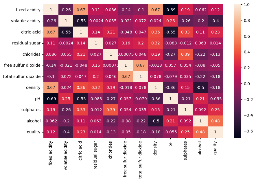
print(f"Shape after dedup: {df.shape}")The correlation matrix quantifies linear relationships between all feature pairs. Values range from -1 (strong negative) to +1 (strong positive). This is the primary analytical tool for understanding which physicochemical properties move together.
df.corr()| fixed acidity | volatile acidity | citric acid | residual sugar | chlorides | free sulfur dioxide | total sulfur dioxide | density | pH | sulphates | alcohol | quality | |
|---|---|---|---|---|---|---|---|---|---|---|---|---|
| fixed acidity | 1.000000 | -0.255124 | 0.667437 | 0.111025 | 0.085886 | -0.140580 | -0.103777 | 0.670195 | -0.686685 | 0.190269 | -0.061596 | 0.119024 |
| volatile acidity | -0.255124 | 1.000000 | -0.551248 | -0.002449 | 0.055154 | -0.020945 | 0.071701 | 0.023943 | 0.247111 | -0.256948 | -0.197812 | -0.395214 |
| citric acid | 0.667437 | -0.551248 | 1.000000 | 0.143892 | 0.210195 | -0.048004 | 0.047358 | 0.357962 | -0.550310 | 0.326062 | 0.105108 | 0.228057 |
| residual sugar | 0.111025 | -0.002449 | 0.143892 | 1.000000 | 0.026656 | 0.160527 | 0.201038 | 0.324522 | -0.083143 | -0.011837 | 0.063281 | 0.013640 |
| chlorides | 0.085886 | 0.055154 | 0.210195 | 0.026656 | 1.000000 | 0.000749 | 0.045773 | 0.193592 | -0.270893 | 0.394557 | -0.223824 | -0.130988 |
| free sulfur dioxide | -0.140580 | -0.020945 | -0.048004 | 0.160527 | 0.000749 | 1.000000 | 0.667246 | -0.018071 | 0.056631 | 0.054126 | -0.080125 | -0.050463 |
| total sulfur dioxide | -0.103777 | 0.071701 | 0.047358 | 0.201038 | 0.045773 | 0.667246 | 1.000000 | 0.078141 | -0.079257 | 0.035291 | -0.217829 | -0.177855 |
| density | 0.670195 | 0.023943 | 0.357962 | 0.324522 | 0.193592 | -0.018071 | 0.078141 | 1.000000 | -0.355617 | 0.146036 | -0.504995 | -0.184252 |
| pH | -0.686685 | 0.247111 | -0.550310 | -0.083143 | -0.270893 | 0.056631 | -0.079257 | -0.355617 | 1.000000 | -0.214134 | 0.213418 | -0.055245 |
| sulphates | 0.190269 | -0.256948 | 0.326062 | -0.011837 | 0.394557 | 0.054126 | 0.035291 | 0.146036 | -0.214134 | 1.000000 | 0.091621 | 0.248835 |
| alcohol | -0.061596 | -0.197812 | 0.105108 | 0.063281 | -0.223824 | -0.080125 | -0.217829 | -0.504995 | 0.213418 | 0.091621 | 1.000000 | 0.480343 |
| quality | 0.119024 | -0.395214 | 0.228057 | 0.013640 | -0.130988 | -0.050463 | -0.177855 | -0.184252 | -0.055245 | 0.248835 | 0.480343 | 1.000000 |
A heatmap makes the correlation matrix easier to scan. Darker colors indicate stronger correlations. Notable relationships include the strong negative pair between fixed acidity and pH (-0.69), and the moderate positive correlation between alcohol and quality (0.48) which makes it a promising predictor.
plt.figure(figsize=(10, 6))
sns.heatmap(df.corr(), annot=True)
plt.show()
Out[21]:
<AxesSubplot: >
The quality column is the target. Counting how many wines fall into each score reveals the class balance — or more accurately, the imbalance. Most wines cluster around 5 and 6, while extreme scores are rare.
df['quality'].value_counts().sort_index().plot(kind='bar')
plt.xlabel("Wine Quality")
plt.ylabel("Count")
plt.show()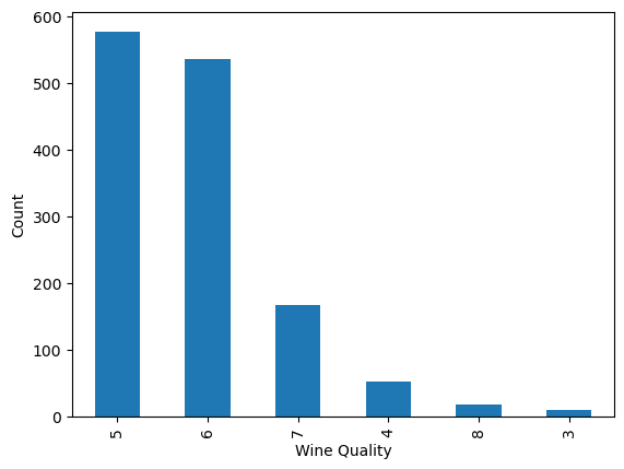
Plotting distributions for each feature helps spot skewness, outliers, and modes. A histogram with a KDE overlay shows both the frequency and the estimated density for each column.
for column in df.columns:
    sns.histplot(df[column], kde=True)
    plt.show()
Alcohol, as one of the stronger correlates with quality, deserves a closer look. Its distribution peaks around 9.5–10%, with a long tail toward higher percentages that correspond to better-scored wines.
sns.histplot(df['alcohol'])
plt.show()
Multivariate plots reveal interactions between features that correlations alone miss. Pairplots show all pairwise relationships in one grid, box plots grouped by quality highlight how alcohol levels shift with score, and scatter plots with color encoding by quality expose patterns across three dimensions.
sns.pairplot(df)
plt.show()
Grouping alcohol by quality in a box plot confirms the positive trend: wines with higher quality scores tend to have higher alcohol content, with noticeably less overlap at the extremes.
sns.catplot(x='quality', y='alcohol', data=df, kind='box')
plt.show()
A scatter plot of alcohol versus pH, colored by quality, shows how two features interact. Lower pH (more acidic) wines with higher alcohol tend to score better — a pattern that emerges only when looking at variables together rather than in isolation.
sns.scatterplot(x='alcohol', y='pH', hue='quality', data=df)
plt.show()
The dataset is clean — no missing values — but the 15% duplicate rate and the imbalanced quality distribution both demand attention before any modeling effort. Alcohol shows the strongest positive correlation with quality (0.48), while volatile acidity has a notable negative relationship (-0.40). These signals guide which features to emphasize in a predictive model.